@ltp did a nice job building a small recycling station for stowing our e-waste and steel waste rather than creating an abstract art piece in the trailer for the next person to deal with next time they want to use it.
It makes sense to organise it prior to loading the trailer so the drop-off can be as efficient as possible.
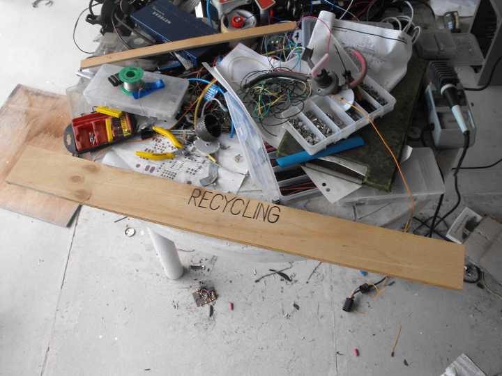
As part of this, I’m just in the process of building up a sign that can go on the station to indicate where everything will go. Did think about using the laser cutter to etch some plywood, but even the laser cutter is not the fastest tool in the world, especially when doing solid fills. I considered doing a compromise by cross-hatch filling the text, but getting Inkscape to generate a cross-hatch fill for the text that Visicut would understand proved to be a pain, so I decided to opt for manual methods.
This is the sign started… text done with an old $40 Jaycar soldering station being used as a pyography iron. The plywood here is scrap from my server cluster project… so literally just lying around. Going out for lunch this afternoon, but hopefully I might get back to it tonight and finish it off to bring with me Tuesday.
… and it’s done. I’ll hunt around and see if there’s some clear varnish I can put on it to protect it from the weather (although it’s marine ply, so should last a bit).
I have new respect for the person who designed the HSBNE logo and its font. Not the easiest to replicate with a soldering iron, my scaling is a little off, as is the sizing of some letters elsewhere.
Strictly speaking the guy who made the logo used Calibri for the font. Someone else decided to throw that out and change to the seven-segment font afterwards. I grumbled about that for a long time…
Yeah… I’m not sure what the licensing is on Calibri… that’s a Microsoft proprietary font if I recall correctly, or at least is only licensed with Microsoft Office which not everybody has.
The seven-segment font (CEAB) isn’t too bad to try and do by hand… (and I realise the designer of the logo and the CEAB font are different people). I think I’d have a harder time replicating Calibri.
Earlier I was playing around in Inkscape, and had I gotten that to work (exporting the cross-hatch) all the text would be that CEAB font just to keep the theme going. Since I was doing it by hand… I just stuck with plain simple sans-serif. My kerning is rubbish, but sod it, it’s legible.
I’ve just applied a coat of varnish from a small tin I found in the garage here, so I’ll leave that to dry overnight and see how it looks in the morning.